Custom iconography is a great way to make your site look modern and unique. With so many possibilities, how do you decide what style to create your icons in? In this post, I’ll show you 6 of the most effective ways to style your custom icons for the web.
![]()
1. Line Icon
Line icons are one of the most simple and easy styles to implement on your site. They are versatile and easily blend in with the aesthetic of most sites. They are also easy to reverse to white so you can place them on dark or black backgrounds without much extra work.
If you’d like to make this style seem more detailed, add in more lines and vary the weight of those lines. Thin line icons look really sharp and beautiful on Retina or other ultra-high resolution displays.
![]()
![]()
2. Single Flat Color
Flat, solid color icons are also very simple and versatile. This style tends to be bolder than line icons because there is less negative space for the page background to show through. Again, these are easy to reverse out to white for display on dark backgrounds.
![]()

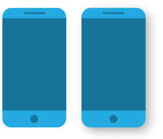
3. 2-Color
This style adds some detail, but still remains very simple. The 2nd color allows you to create more dimension and depth in your icon design. Here I’ve used the 2nd color to give more separation between the phone’s screen and minor details. You want to avoid outlines, as they flatten the look of the icon and make the style seem outdated.
It is harder to reverse 2-color icons for dark backgrounds because it’s not as simple as changing everything to white. You’ll have to use white and/or a light variation of your original color scheme.
Well-executed drop shadows can give this style some extra depth and start pushing in the direction of Material Design style. If you decide to use shadows to create that depth, make sure all other icons in your set follow the same style. As I said before, consistency is key.

4. Single Line Icon on a Base
When I say “base”, I simply mean having your icon sit on top of a colored shape. Adding a base to your icons is a great way to keep things consistent in your set. Depending on the project, your icons will vary in shape and size. Having a consistent base color and shape for your set allows you to unify the icons visually and keep the dimensions the same throughout.
Here I’ve put a single line icon in white over a blue circle. This keeps the simplicity of a standard line icon, but adds some boldness and color that might be lacking without a base.


5. 2-Color Icon on a Base
This style has the same benefits as the previous style, but with the added detail that a 2-color icon offers. For this one I kept the color scheme monochromatic, but the base could be a great way to introduce a 3rd color or accent color.
One trend I’ve seen lately is to add a hard, cast shadow on the base. It’s a simple and effective way to add depth while still keeping a solid color style.https://logicalmediagroup.com/wp-content/uploads/two-color-base.jpg

![]()
6. Illustrated Icon
At a certain point it becomes hard to distinguish between iconography and illustration. I think the differentiator between the two is the level of detail. Icons are supposed to be a simplified representation of an object. Once you start adding more detail and color, it becomes more of an illustration.
For this one, I simply added more colors and details such as the content of the screen and the highlight of the glass edge. Details like these show a stronger effort to create a realistic representation of an object. Because of that, I consider this style an illustrated icon.
This style is great for more graphic-focused sites, especially complex sites with a lot of information to convey visually.
I hope you found these tips helpful. Just remember that consistency is key, no matter what style you create your custom icons in. Good luck in your future icon-making endeavors!
![]()