Google Fonts offers a huge variety of options, including some really great script and handwritten fonts. The problem with many of these fonts is that they aren’t practical; virtually unreadable and not functional for the web.
I’ve complied a list of 18 of the best-looking, functional, readable, free handwriting and script fonts.

Qwigley is an energetic and beautiful script font. It has some great flourishes and variation in the width of the strokes. It’s fun without looking childish (which can be a problem with a lot of handwriting fonts). Mix it with a small, thin, sans serif font to create a really nice font pairing.
View Font>


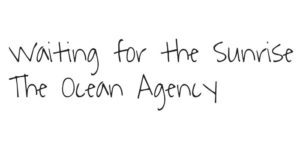
The consistency of letter size and the single stroke width make this a very clean and simple font. It feels a little childish, so it might only work for certain styles. Readability is a little difficult at smaller sizes, but it works really well in a paragraph to create the feeling of a high school notebook.
View Font>


This is a versatile and interesting font. Readability is pretty high at all sizes, and it has a lot of energy. The stroke width varies just enough to give it some personality. I could see this being used for headlines or short paragraphs.
View Font>

Yellowtail is reminiscent of old handwritten sign fonts. I’d stick to large headlines for this one, as the thick stroke makes body copy a little hard to read.
View Font>


Similar to Qwigley, Stalemate is energetic script font with some great variation in the stroke widths. The decorative flourishes are kept to a minimum. The letters are very expressive and have a great feeling of movement in them.
View Font>


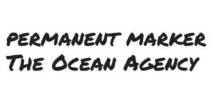
Sparing us the clever name, Permanent Marker is a no-fuss, functional, and versatile font. This is one of my all-time favorites. It can be used for more serious aesthetics, or more lighthearted and fun styles. It pairs nicely with a thin, small, sans serif font. Tilt your headline text just a bit with this font and you have yourself some really punchy typography.
View Font>

Berkshire Swash is more of a traditional, classy font compared to the others. The serifs have some really lovely but subtle flourishes. The readability is surprisingly good, although I’d still stick to larger headlines for this one. The flourishing and taper of the strokes is better appreciated at a larger size. The thick stroke makes it pretty impactful while still remaining subdued and mature.
View Font>


This is another more traditional and elegant font. Niconne has great readability, versatility, and some minimal decoration. It flows smoothly and has a bit of tilt to it, giving it a traditional feel. There isn’t much to dislike on this one.
View Font>


Rock Salt is big, bold, with explosive of energy. The relatively thin stroke lets you create really large headline text without being too overwhelming. It has some interesting marker-like texture on the edge of the strokes. I’d use this sparingly for large, short headlines. Readability is difficult at smaller sizes. As with a lot of these really loose, textured handwriting fonts, they pair well with a small sans serif font.
View Font>


This font strikes a really nice balance of handwriting font characteristics. It’s fun and energetic, while not being too childish. The readability is pretty good at all sizes. This font stands out from a lot of the other fonts because it is so condensed. A lot of times, this style of font can take up a lot of horizontal space. Chewy uses some tight spacing and narrow letters to give you a really functional typeface.
View Font>


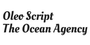
Oleo Script is another one of my favorites. All around it is a solid font. It’s pretty classy, mature, and understated. The stroke is thick and has a bit of tilt, giving it a traditional feel.
View Font>

Playball is a really beautiful, traditional script font. The strokes have some subtle width variation and are easily read. This font flows really nicely and can be used in a variety of styles.
View Font>


Pompiere is quickly becoming one of my favorites. It is very functional, readable, and versatile. The subtle texture and variation in the stroke feels very natural. Try it large in all caps for some fun headlines, or smaller in body copy for a very delicate and lovely feel.
View Font>


This script font has some beautiful, sweeping strokes. It’s energetic while still being clean and sturdy. It’s very mature and classy. Readability is a bit difficult at medium to small sizes, so I’d use this one sparingly for large headlines or accent text.
View Font>


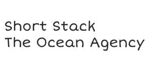
Sometimes you need a fun and childish font. Short Stack is great for this. It has really great readability (surprisingly good at small sizes) and packs a lot of personality.
View Font>

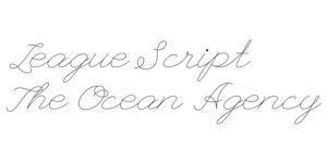
League Script is an extremely delicate cursive font. It’s basically unreadable at smaller sizes, so stick to medium-large sizes for this one. Depending on the context, this font could come off as childish or mature, making it versatile.
View Font>

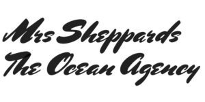
Mrs Sheppard is somewhat of a throwback to old-school brush lettering and calligraphy. It pushes the limit of being functional/readable, but can be really impactful if executed well. This font has a ton of energy and stroke widths vary wildly.
View Font>

This font mimics a flat-nibbed ink pen. Readability is crisp, it is relatively condensed, and has a great energy to it. The connecting script flows very well, making this font an all-around great choice.
View Font>
As you can see, there are a ton of great options to add some personality to your web designs. Don’t forget that you can download Google Fonts to your computer and use them for your other design projects too!