Website hero images, as well as main website landing page images, are a staple of modern web design.
Because users are constantly shifting from one website to another (According to Contentsquare (via HubSpot), the average time spent on a website in 2021 was 54 seconds), it’s hard to keep the attention of people visiting your website.
So, how does one capture and grab people’s eyes who are landing on your site?
Whether we’re speaking about website hero images (read: banner or header images) or simply a website’s landing page images that are the focal point, large and captivating photos can grab anyone’s attention.
Something to keep in mind: With increasingly fast internet and higher screen resolutions (even on phones — and remember, mobile web design with SEO in mind is crucial!), there are a plethora of possibilities concerning attention-grabbing imagery.
One of the greatest challenges with landing page images is readability and accessibility. Without any overlay treatment, the text is virtually unreadable. You can have the most beautiful photo, but if your messaging is lost then the hero image isn’t effective.
Looking for a few ways to incorporate updating your imagery into your next website brainstorming session with a Creative team? We have your back. In fact, here’s what Logical’s Creative Team Manager, Mallory Johnson, said about website hero images…
“Your website hero image is the first thing your visitors see, and it needs to make a great impression. But here’s the catch: the text in that image is just as important as the visuals. If it’s clear and meaningful, it helps visitors instantly understand what your website is all about. This means they won’t be left scratching their heads, and that’s a big win for keeping them engaged and making your website easy to use. Taking the time to be sure it not only looks good but also speaks clearly – will pay off big time!”
Here are 9 ways to make your website hero images and your landing pages images truly pop.
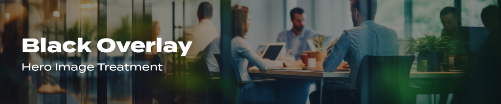
Black Overlay
This is the most simple and straightforward way to create a hero section for your website. Whether it’s pure black at 65% opacity or 45% opacity, it’s hard to go wrong with this method.
Tip: One problem with using black or other dark colors is that it makes the colors of your photo seem dull. Increasing the saturation of the photo is a great way to counteract the dulling effect of the black overlay and keep readability great.
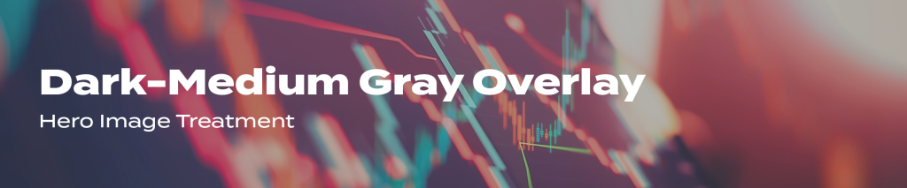
Dark-Medium Gray Overlay
Looking to make the web page or landing page you’re working on feel a bit lighter and more delicate? What can be effective is utilizing an #555555 gray overlay at 80% opacity.
With these dark to medium grays, you can increase the opacity of the overlay significantly more, maintaining readability while still keeping the feel pretty light.
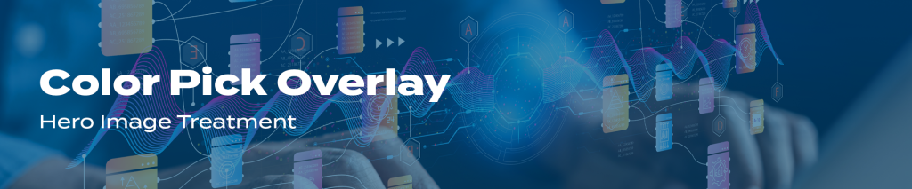 Color Pick Overlay
Another option is to use a color overlay instead of a black or neutral gray. Many times, more jewel-toned colors (think of blues, greens, or purples), work best.
Additionally, what also is effective in a color overlay is selecting a dominant color from the photo from which you’re using as it will blend naturally.
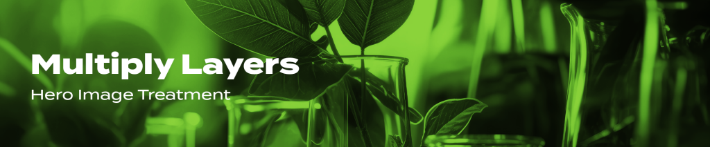 Multiply Layers
Photoshop and other photo editing software often have what is called a “multiply” layer mode. There are a couple of steps involved in this more advanced method.
- Take your photo and make it black and white (desaturate)
- Make a layer of solid color below the photo layer
- Set your photo layer to multiply
In the most simple terms, the multiply mode takes the lightest tones of your photo and makes them transparent.
- Pure white = fully transparent
- Pure Black = fully opaque
- Everything else will vary in transparency, depending on the lightness or darkness of the tone
For example, choosing specific photo layers to be set at certain levels of opacity will speak to landing page users differently. For instance, at 30% opacity of a photo layer, the landing page image will look more subtle and allow more color to show through; whereas a photo layer of 100% opacity will showcase a bolder and darker feel.
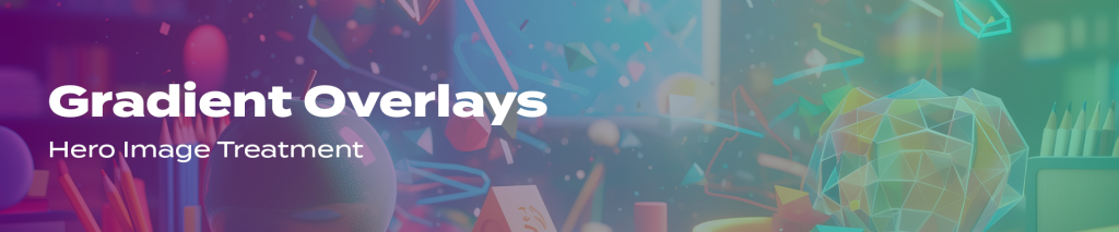 Gradient Overlays
Utilizing gradients tends to be part of a trend, so use with some caution, especially taking into consideration the gradient color. Selecting a gradient color that is complementary rather than shocking is likely the way to go: overdoing the effect can create an off-brand look and turn users off.
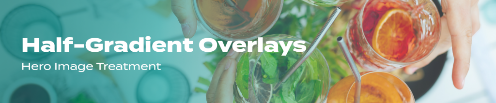 Half-Gradient Overlays
Sometimes you simply want the beauty of your photo to show through, yet the full overlay treatment doesn’t always work with every aesthetic.
If this is your case, then a simple black-to-transparent gradient from the bottom of the website hero image (or the main landing page image!) is a unique choice. By using a half-gradient overlay, the creative look and feel is introduced while any text that has been placed on the image is still legible.
You have many possibilities for this style, figure out the best by trying out a variety of options.
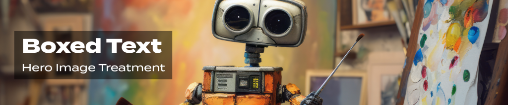 Boxed Text
This option isn’t the most versatile solution, but it can work well with many aesthetics. The benefits of this are that a large portion of the photo is clear and untouched, while the text is extremely legible.
Using boxed text usually works best with bold styles and where the image is just as compelling as your messaging.
Tip: Make sure there is enough padding between the edges of your box and your text. Otherwise, you run the risk of it looking poorly executed and like mouse-selected text.
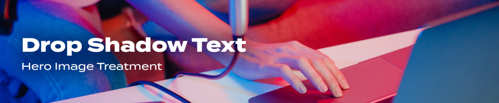 Drop Shadow Text
Sometimes all you need is simplicity in the form of making your text legible and that means using a drop shadow. It’s not the most readable option, but it keeps the photo untouched better than most of these other options listed here.
Keep in mind that a harsh-edged shadow is going to look cheap and poorly executed. A soft shadow around the edges will blend into your photo subtly and increase readability.
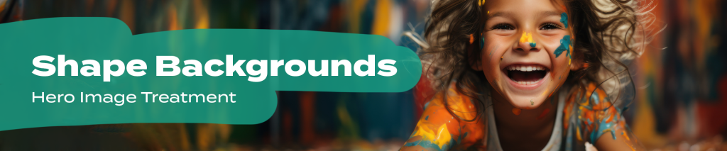 Shape Backgrounds
One final option in styling your website landing page images or hero images is to take the boxed text style to another level and incorporate shape backgrounds for your text. This allows for creativity as far as color and opacity go. Although shape backgrounds won’t work for all brands, it can create a fun and bold effect.
Looking for ways to introduce some of these ways of styling your website’s hero image or landing page images to make them stand out, while also being legible? The Creative team here at Logical Media Group works in a way that allows your brand voice and messaging shine through.
Get in touch with Logical to start on your website’s next Creative project.